Are you living in a compact home with limited square footage? While there's not much you can do structurally, there are some little tricks that add to the sense of expanse and create the illusion of a bigger space. And colour is one of them! Picking the right colour palette for your home can visually expand it and make it seem larger than it usually is. Alongside, the right hues lend to the aesthetic appeal. But, on the other hand, the wrong choice of colours may give your home a claustrophobic appearance and make it feel closed. So, here are the best colours (and the colour code at Asian Paints!) to make your home look bigger, and what other colours will match the prime one. So add decor and soft furnishings in those hues to make it better.

8 Pastel Colours To Use To Make Your Home Look Larger
Light Grey
Grey offers the versatility of sophistication and the convenience of understated luxury. For some, this hue may be boring — however, hang a few right accessories, and you have a stunning aesthetic that enhances the visual expanse and serves as the living room's focal point. Do remember that for an expansive look one should use a monochromatic decorating grey scheme. For example, the Silver Grey (Code 0615) exudes a crisp and pleasant feel to create a more spacious feel. You may have heard that you can make a small space feel bigger by painting the wall a lighter shade. It beautifies the wall and adds visual depth but doesn't really eat up on space. Take a look at this solid macrame wall hanging in mustard for the same.
Complementing Colours: Dark grey, pastel pink, earthy red, blue and yellow.
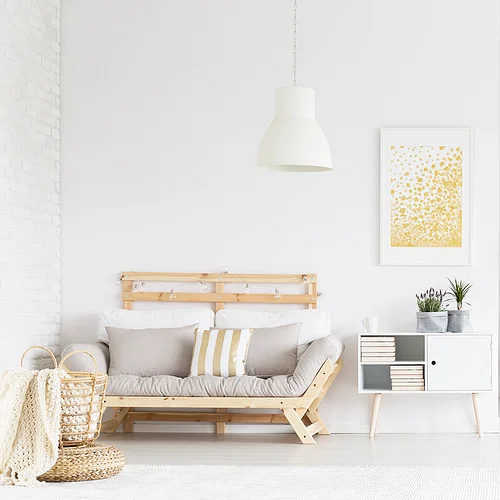
White
Classic and timeless, white is the go-to colour for smaller homes that seem a little closed-off. You can also pair it with a white rug, white sofa, white TV console and white coffee table (just to name a few) and create a seamless and breezy look. This Shriya's Beats farmhouse styled vintage frame is a dialogue in distressed, shabby chic decor and gives a whole new dimension to white. Complement it with Luna Nueva's The Crescent Dreamcatcher on the wall to create a layered vignette. The end result is a touch of French decor in your compact home without piling on volume or making the area seem claustrophobic. On the walls, if you are not a fan of Absolute White (L161) or seek a different tone, then Mirage White (Code 8276) gives a new lease of life to compact spaces and expands the area visually.
Complementing Colours: Almost anything on the colour wheel from electrifying blues to candy pastels
Yellow
Yellow is a hue that brings in a dash of cheer and sunshine. While it may seem a tad too bright for most people, there are a lot of softer and muted versions of yellow that allow you to experiment. If you are looking for more inspiration, How To Make Your Home Look Bigger With Products Under INR 5,000 has plenty of ideas. For example, a mirror automatically brings in a feeling of more space by reflecting light. When paired with a nice, pale yellow border, you can elevate the design. Of course, you can go bold on yellow too. For example, this Terracotta Aakriti Art Creations features hand-painted yellow pots or matkis. Just hang them against a yellow wall to brighten up a dull living room infinitely. On the walls try juxtaposing Sporty Yellow (X104) for inducing vibrancy or for a monochrome feel pick Yellow Iris (Code 7937). Both of these hues reflect light and provide a space-enhancing effect.
Complementing Colours: Light or dark greys, pale blue and white.
Blue
Dark blue tends to recede from the viewer – which is a trick that you can use to your advantage like Lost Blue (Code-9182) as accent wall or Gentle Blue (Code 1276) for a subtle impact. Remember that the colour plays on our eyes and, when used on walls, will visually enlarge the space. There are so many ways to use the dark tones of blue as a great background to mount art. Do remember that when using any oversized artwork in tight quarters, pairing it with a darker hue like blue makes the space seem bigger than it actually is. If you want blue in smaller doses, the Blocks of India table cover with elephants offers a striking contrast.
Complementing Colours: Muted pink & yellow and light grey.
Beige Or Cream
It's a safe, understated and neutral colour that creates a cohesive look increasing the sense of square footage without trying too hard. There's so much you can do with beige as it creates the optical illusion of a larger space. With The Rug Republic, you can get plenty of rugs, pouffes & ottomans, cubes and more to set up muted interiors that catch the eye without trying too hard. Colours like Beige Dream (Code-8779) are the perfect vehicle to highlight other shades and create contrasts with subtle pastels or even go dramatic with darker hues. Even beige on beige looks chic.
Complementing Colours: Dark browns, subtle pinks, greens, blue and rustic red.
Light Green
A touch of nature and a hint of verdure energises the room — and light green – think Green Dawn (Code 9786) integrates this vibe. Something alluring yet refreshing about green opens up the space, whether with a muted sage or moss tone that creates a focal point – thus making the room seem larger. Take a cue from the Yatha vintage style window-shaped wall panel in light green. It gives the appearance of a window and helps make the space seem bigger. Other ideas include bringing in fresh plants or growing a green thumb with a micro-herb garden on the wall. A nice idea to let plants filter the indoor air quality too.
Complementing Colours: White, beige, olive and burnt orange.
Lavender
Lavender and shade closer to it on the colour wheel bring a feminine touch to closed spaces like Lavender Secret (Code 7163) that reflect light for a sense of expanse. A trending favourite is Peri-Wrinkle — the Pantone colour of the year 2022 that is energising and bold at the same. Though lavender is a muted shade, it can bring in drama and imbue a breath of fresh air. Needless to say, it also exudes a cool aura during the summer months. TARA- Sparkling Homes has a set of 2 - watercolour orchids cushion covers that are reversible. Printed floral hues are just right to merge prints with textures and colours.
Complementing Colours: Neutral hues like grey, beige and white.
Pink
Pink is often regarded as a sugary colour, but there are many ways to tone it down. There are ways to infuse more colours like this Vajor Ecru Carpet Rug that creates a space that balances the pink wall's prettiness with contrasting elements like the Tinge Of Pink (Code 8066). Pink in the soft hues on the wall brings relief, keeping the visual appeal. Again the shade works equally well on sofas, chairs, accessories and even furnishing. Contrast it with some black accents for a modern touch, or keep it clean with pastel hues.
Complementing Colours: Dark or light grey, hot pink, teal and sometimes black.
These are eight of the best colours that you use in a compact home for a feel of visual expanse. Do experiment with similar tones of the shades suggested — there is no one-size-fits-all rule.