
My understanding of what a good book cover design should be.
By Nivida Chandra
Book covers - the one second visual summary of the most important element from the book. This makes it THE most critical point of communication between the author’s team and us, the readers; and puts us in a strange position of power. We get to choose if the book cover works or not.
Now the author is the best person to know what this most important element is, but doing your own cover is like asking a patient to do his own surgery - possible lack of appropriate skill, and too close to the subject for comfort {which is why graphic novels and comics often have the most expressive covers}. The designing is, therefore, managed by an ‘art director’ and the decisions are left up to the editor, or worse, the marketing team. So the design is often lost in translation.
This is often the problem, or at least it appears so, in India. No one seems to have read the book carefully before trying to put its essence into visual art.
Here are my two pennies worth on how you can figure out if the book cover’s any good.
The first glance appeal - everything I fore-mentioned applies here.
Then, the retrospective judgment, which comes after you’ve read the book.
Ideally, both should be accomplished.
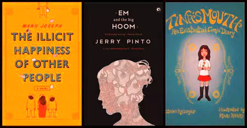
And I have three examples for you.
- Manu Joseph’s 'The Illicit Happiness of Other People'
- Jerry Pinto’s 'Em and the Big Hoom'
- Keshni Kashyap’s 'Tina’s Mouth'
I’m in a bookstore, and I notice a brightly colored book. By default, I’ve already ignored the plethora of drab colors around me. Then I notice the bold type and clear spacing of the letters. I read the text and get a feel of the hardbound book. I’m not a fan of how his name is written, but it doesn’t matter – I’ve already picked the book up now. I notice that someone’s bothered with seemingly meaningful details of these flying papers with little question marks and speech bubbles. Now I read the blurb {which makes for a whole different debate by the way – blurbs are also thoughtlessly written paratexts}. I buy the book. I read it. Now- after I’m over my “I can’t believe how amazing this book is” moment- I look at the cover again, and I get it. It makes sense. Jarrod Taylor, the artist who conceptualized and executed it, seemed to have read the book and conversed with the author. The designer isn’t Indian. Sad, but in this case, that’s possibly a good thing. You’ll soon see why.

Take Pinto’s Em. Aleph has gone the extra mile to make the page ends the same color at the cover – it’s all this lovely purple shade {very Trainspotting of them}. The paper quality is excellent, the cover is beautiful, the type work is good {not a fan of the two accolades forced onto the cover, but that’s marketing for you}, the blurb seems interesting - I’ve already bought the book. I read {and weep deeply}. Again, the cover makes sense. Here’s what I realized - the detailed patterned art is by the author himself. A rare moment, but perfect. Such restraint, no self-promotion, just beautiful. Adding to that is the clear, efficient type-work by Bena Sareen. There’s even a good-looking spine.

Now I’m going to get a little negative. Take this “graphic novel” {I DO NOT deem it as one, though it has been marketed so}, Tina’s Mouth, which for the longest time I read as TinPC’s Mouth. So ugly {in every aspect} that I made someone buy it for me. I couldn’t bear to be seen with it. Turns out, the content wasn’t half bad. As slightly modified text, I may have even liked it a bit. But the art and lettering were just hideous and repulsive. My eyes wanted to spontaneously combust {I didn’t have the patience to gouge them out}. Whoever said, and I underline this, that this book follows “in the tradition of Persepolis and American Born Chinese” {two stunning, classic pieces of work} deserves to be stoned in public.

Here’s why I bought this up. I think a lot of people might find the cover appealing. I get the marketing strategy. Everything is pseudo-psych-flower-child-emo, bright colors, some funny handwriting style. A safe, clever route. It’s the monarch butterfly of book covers. There are much, much uglier covers in the market, but I chose this because it pretends to be pretty, and could be mistaken for a good one. Those ones are out rightly grotesque, like Manto’s Mottled Dawn {masterpiece reduced to tatters because of its cover}.
In terms of industry, I would appeal to all graphic designers working with book covers to think through what it is that the book is trying to say. Read the book. Speak to the author. Get a feel for it. And remember that the cover is not just the front, but the back and the spine too. It should speak on behalf of the author.
Now eventually it really is up to you to find a cover beautiful or not – I wish I could shoot you for your wrong choices, but I can’t. So my simple summary would be to say what I’ve said repeatedly. A good book cover should be synchronous with what the book is trying to say.
It should make sense.
About the Author | Nivida is the founder and errand girl at Page99 {www.page99.in}. She's a lit-purist, an absolutely lazy person, eco-buff, and pseudo-psychologist doing her PhD at IIT-Delhi. As you can see, she's quite opinionated, but very open to your correct views.
The awesome Dev Kabir Malik {www.devkabirmalik.com},a graphic design graduate from National Institute of Design with an unhealthy obsession for type, music and image making, has done the graphics for this feature.