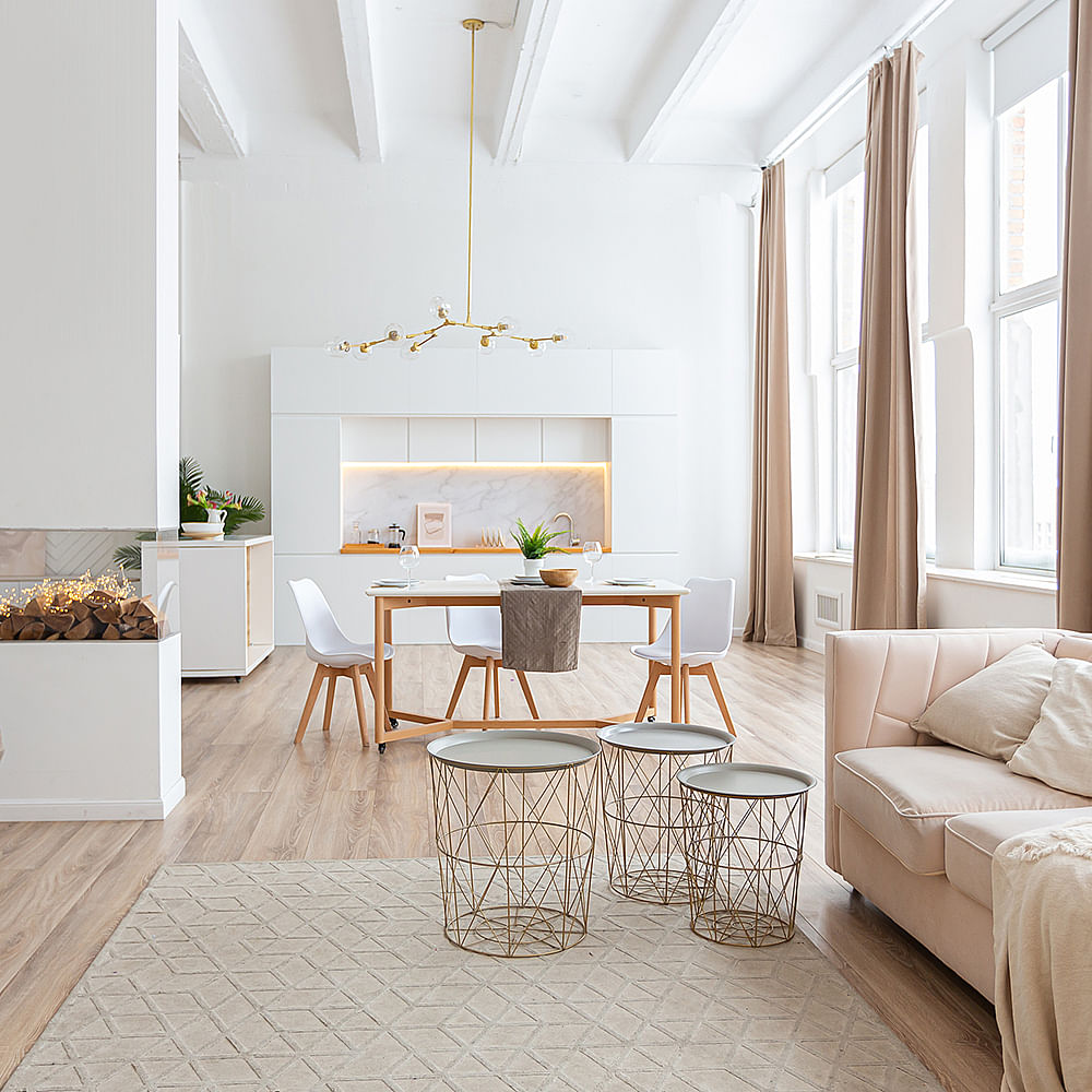
Scandinavian style is a design movement that developed in the Nordic countries of Denmark, Finland, Sweden, Norway, and Iceland but slowly and steadily became a favourite around the globe. Scandinavian interior design emphasises on simplicity, lightness, functionality, and the beauty of everyday objects with the spotlight on decluttering. It's about getting rid of the extras or attention-seeking elements as well as embracing natural textures, and clear, simple lines that evoke a sense of calm and capacity. This is what makes it an instant hit among minimalism lovers. So, if you feel inspired and want to give your home a Nordic theme, then check out our ideas and product recommendations to give a similar vibe to your home.
Scandinavian Interior Design: 7 Ideas For A Simple Yet Functional Space
Minimise or Declutter


One thing you won't find in a Scandi-designed home is clutter. Decluttering the space you want to revamp is one of the first steps in giving your home a Scandinavian feel. Traditionally, Scandinavian homes were small, and household income was low which meant that there simply wasn't enough space or money for a lot of decorative items and clutter in general. Now while you don't have to get rid of everything to create your space, you should carefully curate the items that are visible to maintain that calm mood. So, get your hands on a few organisers, baskets and racks to pack up your knick-knacks.
Maximise Natural Light


While there is little you can do to bring in more natural light, understanding from where and focusing on the points from where the natural light pours in is the key. In a living room with little natural light, ensure the colours simple to keep the vibe of the place light and airy. While the windows in Scandinavian homes are large and unobstructed to let in maximum light. For more tropical climates like India, you can stick to sheer curtains or blinds for nighttime.
Stick To Neutral Colours


When it comes to colour, mimic nature's palette—think earth, stone, and wood, with pops of brighter colours. A neutral colour scheme is simple yet sophisticated and adds lightness to the space. The treatment for walls and flooring in Scandinavian interior design is mostly white as white walls make the space appear bigger and brighter. This backdrop also allows the furniture pieces to serve as accents, breaking monotony. For furniture, stick to the same colour scheme with blonde wood or light wood touches.
Add Nature & Plants


As natural resources were scarce in Scandinavian countries, natives had a distinct and hard-earned appreciation for nature. To get the most out of what nature had to offer, people had to learn to work with it, to understand and respect it. And thus, they tried to incorporate elements of it into their homes as much as possible. When you incorporate plants into your home, you add life and texture to your space. Plants also add pop of colours, ranging from the obvious green tones to red and purple shades while maintaining the minimalist and natural feel. Do make a note and use planters in neutral shades to create harmony.
Pro-tip: How to add nature to your city home.
Add Sustainable Natural Elements


It is not surprising that Scandinavian design has developed a style that favours sustainability, which speaks to their non-consumerism approach. It's all about valuing quality craftsmanship so that each element lasts and you don't scorch money on repairs or replacements, a regard similar to our respect for nature and Indian tradition of crafts. Think lamp shades, platters and anything made from jute, bamboo, and natural fibers alike. They add a touch of texture and contrast to the place, breaking the monotony of the neutrals in a not-so-in-your-face kind of way. And with India too being blessed with artisanal craftsmanship, it only makes sense we cherish and put them on display.
Create Subtle Contrast


What we mean by subtle contrast is not to use colours at the opposite ends of the colour wheel but rather elements in different shapes, sizes, textures and moods. Instead of contrasting colours, contrast light and dark neutrals, old and new decor pieces, abstract and natural souveniers, straight and wavy figurines, hard and soft surfaces, you get the gist. Another way of creating contrast for the walls is to introduce graphic patterns. As in other aspects of Scandinavian design, the graphic side boils down to minimalism and maintaining natural beauty within the functionality of the design. Oversized prints and patterns become statement pieces in an otherwise simple, calm, well-balanced interior.
Add Some Hygge


An essential aspect of Scandi homes is balancing the coolness of white and clean lines which at times feel too stark and uninviting by softening the look with warmer textures and colours, and another absolutely important piece of the puzzle: hygge. Hygge is a Danish word that translates to cosy togetherness that brings about a feeling of well-being or contentment. While installing a fireplace isn't an option for most of us, you can employ objects that remind you of warmth (read: snug and homey). Think scented candles, soft blankets, comfy cushions, rugs and tall chairs.

